Wednesday, April 22, 2009
The Semester Winds Down
I’ve been busy as the spring semester closes, keeping up with painting for my three classes and also trying to do things on my own as well. But it has been enjoyable, and I feel my work changing as I gain confidence in my skill. I’m particularly getting good comments on the homework assignments to paint vegetables and fruit. These are studies in how to represent round objects so they don’t look flat, and to learn to see the reflected colors on and from adjacent surfaces, and represent the subtle changes in color and value across rounded objects and their shadows.
Anyway, after all that, here is the result of the Doug Martenson’s assignment to paint garlic on a white surface. I chose to make a small painting so that the garlic cloves could be approximately their real size without getting lost in the overall painting. The brown wall behind the table was my attempt to add some contrast to the painting. That is spillover from my other course with Giovanni Casadei, who keeps stressing the importance of RELATIONSHIPS in painting - of color, space, value, intensity, size...
 Garlic II
6" x 8", oil on board
For the final assignment, Doug suggested painting an apple along with some ceramic pieces. I bought some ceramic throwaways from a thrift store for this, but then decided that I would prefer to use my own set of coffee cups that fit the hand so well, and that were a Bon Voyage gift ‘way back in 1990. The apple was a Stayman Winesap - my favorite - instead of the usual darker Delicious with its more distinctive shape. Then the final choice was to put these objects on my bookshelf and use that, with its books, as the backdrop. So:
 Bookcase
8" x 12", oil on canvaspad
This all worked out surprisingly well. At first the books were too prominent, and Giovanni suggested glazing them back. I did that with purple, and while the effect was subtle, it made a tremendous difference. In the class critique, the painting got good marks. Doug wondered whether I had deliberately painted it as a trompe-l’oil and suggested several trompe-l’oil painters to look up. I hadn’t given that a thought, but after the discussion, it does rather have that feeling to it. Hmmmmm.
Some other thoughts:
My hopes for creating a studio on South Street seem to be fading. The five or six landlords who like the idea of opening empty stores to artists have already done so and the others don’t see the value of the idea, I’m told. The idea isn’t dead, we’re still talking, but meanwhile as the spring semester closes and graduating students make their plans it is likely to become harder to find other artists to join with me. In any case, it was well worth the try.
I attended a presentation by Kehinde Wiley at the Acad of Fine Arts. KW has first class credentials, and has been a professional Fine Artist for probably 10 years now, and is one of the recognized contemporary stars. Ie, he exhibits widely and his stuff is in multiple museums and galleries, and would sell in the five figure range. His work is quite powerful and focused on black manhood. There are typically lots of fillagrees in the background that also wander into the foreground. Example:
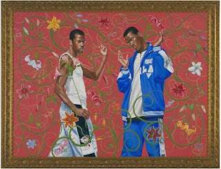 Kehinde Wiley, Annunciation
6' x 8', oil on canvas (2005)
So from his talk and followup discussion I tried to distill what KW did to become such a major figure so quickly - besides being exceptionally good of course, and presumably developing very strong professional contacts. Points:
Verrry interrresting.
Anyway, after all that, here is the result of the Doug Martenson’s assignment to paint garlic on a white surface. I chose to make a small painting so that the garlic cloves could be approximately their real size without getting lost in the overall painting. The brown wall behind the table was my attempt to add some contrast to the painting. That is spillover from my other course with Giovanni Casadei, who keeps stressing the importance of RELATIONSHIPS in painting - of color, space, value, intensity, size...
 Garlic II
6" x 8", oil on board
For the final assignment, Doug suggested painting an apple along with some ceramic pieces. I bought some ceramic throwaways from a thrift store for this, but then decided that I would prefer to use my own set of coffee cups that fit the hand so well, and that were a Bon Voyage gift ‘way back in 1990. The apple was a Stayman Winesap - my favorite - instead of the usual darker Delicious with its more distinctive shape. Then the final choice was to put these objects on my bookshelf and use that, with its books, as the backdrop. So:
 Bookcase
8" x 12", oil on canvaspad
This all worked out surprisingly well. At first the books were too prominent, and Giovanni suggested glazing them back. I did that with purple, and while the effect was subtle, it made a tremendous difference. In the class critique, the painting got good marks. Doug wondered whether I had deliberately painted it as a trompe-l’oil and suggested several trompe-l’oil painters to look up. I hadn’t given that a thought, but after the discussion, it does rather have that feeling to it. Hmmmmm.
Some other thoughts:
My hopes for creating a studio on South Street seem to be fading. The five or six landlords who like the idea of opening empty stores to artists have already done so and the others don’t see the value of the idea, I’m told. The idea isn’t dead, we’re still talking, but meanwhile as the spring semester closes and graduating students make their plans it is likely to become harder to find other artists to join with me. In any case, it was well worth the try.
I attended a presentation by Kehinde Wiley at the Acad of Fine Arts. KW has first class credentials, and has been a professional Fine Artist for probably 10 years now, and is one of the recognized contemporary stars. Ie, he exhibits widely and his stuff is in multiple museums and galleries, and would sell in the five figure range. His work is quite powerful and focused on black manhood. There are typically lots of fillagrees in the background that also wander into the foreground. Example:
 Kehinde Wiley, Annunciation
6' x 8', oil on canvas (2005)
So from his talk and followup discussion I tried to distill what KW did to become such a major figure so quickly - besides being exceptionally good of course, and presumably developing very strong professional contacts. Points:
- It is clearly essential to have a VERY LARGE body of work on hand, to discuss, sell, exhibit, show. Asked whether he does all the painting himself, KW replied “Of course not. I couldn’t possibly do all this. I have a group of assistants who do much of the background and filagree work and I concentrate on the core of the painting.” (Oh!)
- KW doesn’t restrict himself to direct painting. He also uses photography, projection, digital manipulation, anything that is available to him. (Come to think of it, why SHOULDN’T an artist use every bit of technology that is available to him/her?)
- KW adopted a very strong focus - at least his approach to it - and DOES NOT DEVIATE FROM IT. So his work is always recognizable immediately. No little landscapes just because they were fun or interesting, for instance.
- Some of the work must be huge. One museum exhibitions was dedicated to his paintings that were typically 15’ x 30’. Now that is BIG!
Verrry interrresting.
![]()