Tuesday, April 28, 2009
Figure Painting
I haven't posted many of the figure paintings I've done this semester, even though I've been taking TWO figure painting courses. All those vegetable/fruit paintings were just homework, another way to learn how to paint rounded shapes and observe how the surfaces react to shadows, reflected light, highlights and glare and stuff. The idea is to then bring these skills back into painting the figure. But painting the human body is still tough. In addition to all the normal shape and shadow problems, the skin is transparent with all those subtle responses to the interior muscles and bones, and arms and legs are so likely to end up looking like sausages, tubes or columns.
For all that, I have definitely gotten better over the semester, and it has been interesting that the careful work with Doug Martenson (multiple sittings of the model in the same pose) with the more instinctive approach of Giovanni Casadei (one or two finished paintings in every session) have complemented each other. So now I even have some figure paintings that I don't cringe to put up on the walls of my Salon. (It used to be my "apartment" but by now it is so full of painting paraphernalia and stuff that it is more of a studio/salon. I have to clear stuff away to put down my plate for breakfast.)
So here is some of my late coursework. First, from the longer painting sessions with Doug:

I really disliked this sitting. The model was a beautiful woman, placed in the center of the room. But I was a little late getting to the class and all the good viewing angles were already crowded so I ended up behind her looking at more chair than model.
For Susan's second pose I made sure I had a good position. There was a fantastic flowing line from the top of her hip to the foot, and I wanted to be sure to feature that. I like the way the value contrast with the dark, cool background worked out, and the green foreground seems to work well too. It was hard to deal with that drastic twist in her body, in which the axis of her hips is almost at right angles to the axis of her shoulders.

In my other figure painting class, Giovanni has been stressing the importance of RELATIONSHIPS in our painting, and says that our goal is not to make masterpieces but to try new things and new ways to paint, to work without an idea of what we want the end result to look like. I find that exceptionally difficult to do, after a whole career of analysing things and defining goals before starting any project.
Before yesterday's class I asked Giovanni to demonstrate how he starts a painting without having an end idea in mind. He agreed, and talked while he began the little sketch below. First he considers the model, who was a very warm color, against the background that was a cool, somewhat blue-ish color. The blank canvas was an overall warm brown, so he began by putting in the cool background, leaving a negative space to fill in with the model. Then he began matching colors to the highlights on her head and shoulders and laying those in very loosely. It was magical to see the beauty of the colors and relationships take shape, even at this early stage of painting:
 Giovanni's Demonstration, 10" x 8", oil on board
I picked up from there, starting fresh with a new canvas. My work soon became analytical again - I can't keep from wanting it to "look right." In a way, this is a form of insecurity - a feeling that every painting must be "good," or "beautiful" - and it absolutely gets in the way of spontaneity. It is the loss of freedom that children have to just pick up crayons and play - before they are taught that they are supposed to stay within the lines.
Even just the attempt to paint without trying to be "right" all the time produces some interesting results. In my followup painting of the same model there is a nice volume to the torso, and this is one of those things that I still find hard to achieve:

And here are two more of my figure paintings from Giovanni's class. I'm a little sorry that there is only one more class before the end of the semester, now that things seem to be coming along pretty well. But it does feel like time to take a break, and during June I will be taking a drawing course entitled Conquering Hands and Feet. I don't know about the "Conquering" part, but I sure will be glad to have some instruction on handling those appendages with more skill!


For all that, I have definitely gotten better over the semester, and it has been interesting that the careful work with Doug Martenson (multiple sittings of the model in the same pose) with the more instinctive approach of Giovanni Casadei (one or two finished paintings in every session) have complemented each other. So now I even have some figure paintings that I don't cringe to put up on the walls of my Salon. (It used to be my "apartment" but by now it is so full of painting paraphernalia and stuff that it is more of a studio/salon. I have to clear stuff away to put down my plate for breakfast.)
So here is some of my late coursework. First, from the longer painting sessions with Doug:

Susan, 11" x 14", oil on canvaspad
I really disliked this sitting. The model was a beautiful woman, placed in the center of the room. But I was a little late getting to the class and all the good viewing angles were already crowded so I ended up behind her looking at more chair than model.
For Susan's second pose I made sure I had a good position. There was a fantastic flowing line from the top of her hip to the foot, and I wanted to be sure to feature that. I like the way the value contrast with the dark, cool background worked out, and the green foreground seems to work well too. It was hard to deal with that drastic twist in her body, in which the axis of her hips is almost at right angles to the axis of her shoulders.

Susan II, 11" x 14", oil on canvaspad
In my other figure painting class, Giovanni has been stressing the importance of RELATIONSHIPS in our painting, and says that our goal is not to make masterpieces but to try new things and new ways to paint, to work without an idea of what we want the end result to look like. I find that exceptionally difficult to do, after a whole career of analysing things and defining goals before starting any project.
Before yesterday's class I asked Giovanni to demonstrate how he starts a painting without having an end idea in mind. He agreed, and talked while he began the little sketch below. First he considers the model, who was a very warm color, against the background that was a cool, somewhat blue-ish color. The blank canvas was an overall warm brown, so he began by putting in the cool background, leaving a negative space to fill in with the model. Then he began matching colors to the highlights on her head and shoulders and laying those in very loosely. It was magical to see the beauty of the colors and relationships take shape, even at this early stage of painting:
 Giovanni's Demonstration, 10" x 8", oil on board
I picked up from there, starting fresh with a new canvas. My work soon became analytical again - I can't keep from wanting it to "look right." In a way, this is a form of insecurity - a feeling that every painting must be "good," or "beautiful" - and it absolutely gets in the way of spontaneity. It is the loss of freedom that children have to just pick up crayons and play - before they are taught that they are supposed to stay within the lines.
Even just the attempt to paint without trying to be "right" all the time produces some interesting results. In my followup painting of the same model there is a nice volume to the torso, and this is one of those things that I still find hard to achieve:

Same model, same pose, 12" x 9" on canvaspad
And here are two more of my figure paintings from Giovanni's class. I'm a little sorry that there is only one more class before the end of the semester, now that things seem to be coming along pretty well. But it does feel like time to take a break, and during June I will be taking a drawing course entitled Conquering Hands and Feet. I don't know about the "Conquering" part, but I sure will be glad to have some instruction on handling those appendages with more skill!


Wednesday, April 22, 2009
The Semester Winds Down
I’ve been busy as the spring semester closes, keeping up with painting for my three classes and also trying to do things on my own as well. But it has been enjoyable, and I feel my work changing as I gain confidence in my skill. I’m particularly getting good comments on the homework assignments to paint vegetables and fruit. These are studies in how to represent round objects so they don’t look flat, and to learn to see the reflected colors on and from adjacent surfaces, and represent the subtle changes in color and value across rounded objects and their shadows.
Anyway, after all that, here is the result of the Doug Martenson’s assignment to paint garlic on a white surface. I chose to make a small painting so that the garlic cloves could be approximately their real size without getting lost in the overall painting. The brown wall behind the table was my attempt to add some contrast to the painting. That is spillover from my other course with Giovanni Casadei, who keeps stressing the importance of RELATIONSHIPS in painting - of color, space, value, intensity, size...
 Garlic II
6" x 8", oil on board
For the final assignment, Doug suggested painting an apple along with some ceramic pieces. I bought some ceramic throwaways from a thrift store for this, but then decided that I would prefer to use my own set of coffee cups that fit the hand so well, and that were a Bon Voyage gift ‘way back in 1990. The apple was a Stayman Winesap - my favorite - instead of the usual darker Delicious with its more distinctive shape. Then the final choice was to put these objects on my bookshelf and use that, with its books, as the backdrop. So:
 Bookcase
8" x 12", oil on canvaspad
This all worked out surprisingly well. At first the books were too prominent, and Giovanni suggested glazing them back. I did that with purple, and while the effect was subtle, it made a tremendous difference. In the class critique, the painting got good marks. Doug wondered whether I had deliberately painted it as a trompe-l’oil and suggested several trompe-l’oil painters to look up. I hadn’t given that a thought, but after the discussion, it does rather have that feeling to it. Hmmmmm.
Some other thoughts:
My hopes for creating a studio on South Street seem to be fading. The five or six landlords who like the idea of opening empty stores to artists have already done so and the others don’t see the value of the idea, I’m told. The idea isn’t dead, we’re still talking, but meanwhile as the spring semester closes and graduating students make their plans it is likely to become harder to find other artists to join with me. In any case, it was well worth the try.
I attended a presentation by Kehinde Wiley at the Acad of Fine Arts. KW has first class credentials, and has been a professional Fine Artist for probably 10 years now, and is one of the recognized contemporary stars. Ie, he exhibits widely and his stuff is in multiple museums and galleries, and would sell in the five figure range. His work is quite powerful and focused on black manhood. There are typically lots of fillagrees in the background that also wander into the foreground. Example:
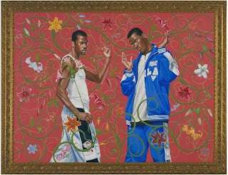 Kehinde Wiley, Annunciation
6' x 8', oil on canvas (2005)
So from his talk and followup discussion I tried to distill what KW did to become such a major figure so quickly - besides being exceptionally good of course, and presumably developing very strong professional contacts. Points:
Verrry interrresting.
Anyway, after all that, here is the result of the Doug Martenson’s assignment to paint garlic on a white surface. I chose to make a small painting so that the garlic cloves could be approximately their real size without getting lost in the overall painting. The brown wall behind the table was my attempt to add some contrast to the painting. That is spillover from my other course with Giovanni Casadei, who keeps stressing the importance of RELATIONSHIPS in painting - of color, space, value, intensity, size...
 Garlic II
6" x 8", oil on board
For the final assignment, Doug suggested painting an apple along with some ceramic pieces. I bought some ceramic throwaways from a thrift store for this, but then decided that I would prefer to use my own set of coffee cups that fit the hand so well, and that were a Bon Voyage gift ‘way back in 1990. The apple was a Stayman Winesap - my favorite - instead of the usual darker Delicious with its more distinctive shape. Then the final choice was to put these objects on my bookshelf and use that, with its books, as the backdrop. So:
 Bookcase
8" x 12", oil on canvaspad
This all worked out surprisingly well. At first the books were too prominent, and Giovanni suggested glazing them back. I did that with purple, and while the effect was subtle, it made a tremendous difference. In the class critique, the painting got good marks. Doug wondered whether I had deliberately painted it as a trompe-l’oil and suggested several trompe-l’oil painters to look up. I hadn’t given that a thought, but after the discussion, it does rather have that feeling to it. Hmmmmm.
Some other thoughts:
My hopes for creating a studio on South Street seem to be fading. The five or six landlords who like the idea of opening empty stores to artists have already done so and the others don’t see the value of the idea, I’m told. The idea isn’t dead, we’re still talking, but meanwhile as the spring semester closes and graduating students make their plans it is likely to become harder to find other artists to join with me. In any case, it was well worth the try.
I attended a presentation by Kehinde Wiley at the Acad of Fine Arts. KW has first class credentials, and has been a professional Fine Artist for probably 10 years now, and is one of the recognized contemporary stars. Ie, he exhibits widely and his stuff is in multiple museums and galleries, and would sell in the five figure range. His work is quite powerful and focused on black manhood. There are typically lots of fillagrees in the background that also wander into the foreground. Example:
 Kehinde Wiley, Annunciation
6' x 8', oil on canvas (2005)
So from his talk and followup discussion I tried to distill what KW did to become such a major figure so quickly - besides being exceptionally good of course, and presumably developing very strong professional contacts. Points:
- It is clearly essential to have a VERY LARGE body of work on hand, to discuss, sell, exhibit, show. Asked whether he does all the painting himself, KW replied “Of course not. I couldn’t possibly do all this. I have a group of assistants who do much of the background and filagree work and I concentrate on the core of the painting.” (Oh!)
- KW doesn’t restrict himself to direct painting. He also uses photography, projection, digital manipulation, anything that is available to him. (Come to think of it, why SHOULDN’T an artist use every bit of technology that is available to him/her?)
- KW adopted a very strong focus - at least his approach to it - and DOES NOT DEVIATE FROM IT. So his work is always recognizable immediately. No little landscapes just because they were fun or interesting, for instance.
- Some of the work must be huge. One museum exhibitions was dedicated to his paintings that were typically 15’ x 30’. Now that is BIG!
Verrry interrresting.
Wednesday, April 08, 2009
More Comparisons
It's been hectic and busy for the past week or two, but even with getting ready for those exhibitions, I've managed to complete some interesting if small paintings. And since a number of them are from homework assignments that repeat what I did a year and a half ago, it is nice to see some development in my style. For instance, I just completed a painting of onions the worked out pretty well. For comparison, here are the onions I painted earlier, too. That earlier painting was the first time I ever tried to paint a fabric with folds, and it shows.
 Onions, 2009: 8" x 10", oil on canvasboard
 Onions, 2008: oil on board, 13" x 10.5"
(I was frequently painting on odd sizes then, too)
Another comparison: I'd painted those bananas (back a couple of postings ago) and got good strokes for them except for the violet purple background that most critics thought took away from the bananas - except for Matthew, who wanted a high resolution copy to use as his screen saver (!). So I replaced the background with a more tame version, and added some additional highlights and nuances at the same time. Which do you like better now? The only thing is - looking at the photos here, the recent version didn't come out as clearly: the yellow is just as brilliant against the lighter background but it doesn't show that way here. Sorry.
 Bananas, first go: 8" x 10", oil on board
 Bananas, redux: same description
While at it, here is the eggplant I painted and that I don't mind showing at all. The highlight was created by rubbing off some of the purple color. That is OK, but purists prefer to create even the highlights by ADDING paint, not removing it. So I worked that way in painting those onions above, and it does give a different effect. I still think the eggplant is better off with the rubbing technique though.
 Eggplant: 8" x 10", oil on board
Wednesday, April 01, 2009
Every silver lining has its cloud.
Lest I get too excited about yesterday's success and allow my head to swell excessively, it must be noted that today I got official notice about my submissions to the OTHER art exhibition going on this April, the 146th Annual Exhibition of Small Oil Paintings (20" x 20" max) by the Philadelphia Sketch Club.
Down in flames. Both of my submissions, one of which I am still quite proud of, were pointedly
Oh well. Just you wait 'till next year !!
Down in flames. Both of my submissions, one of which I am still quite proud of, were pointedly
Not Accepted
Oh well. Just you wait 'till next year !!
![]()